Claire Abendreh - Lesen in Bildern

Schlagwort: Kunstbetrachtung

Akissika

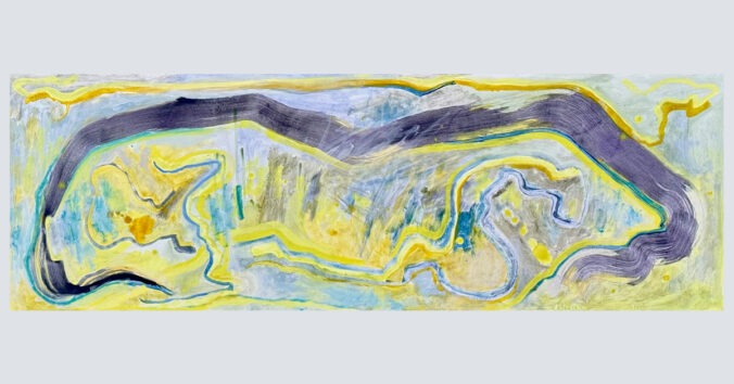
Bernhard Beyer, Tempera auf HDF, 115×39 cm, 02/2026

Ein schmales, liegendes Format – fast wie eine Landschaft, die an einem vorbeizieht, doch saugt diese vielmehr in eine Tiefe hinein. Frontal. Ein breiter, dunkelvioletter Pinselschwung umfängt das Vorgefundene und lenkt alle Aufmerksamkeit auf sich – so entsteht der Bildraum.

Die Bewegung des breiten Pinsels wirkt wie Kalligraphie – schön für das künstlerische Auge. Doch darunter hält der klare Schwung wie eine Kralle etwas in der Bildmitte fest: eine Tatsache, umwerfend klar und zugleich nicht sofort aufzuklären.
Darin fein gemalte Details: Vielleicht Steilhänge, kurvige Wege und sich durch Täler windende Bachläufe.
Oder sind es Chiffren, Runen, geritzte Zeichen einer unleserlichen Schrift – „Akissika“? Gelb bis Türkis, in Grau übergehend, liegen sie schräg und schmutzig auf der hellgelben Bildfläche.

Der Titel, „Akissika“, ein Wort, das sich sperrt, das nicht sofort eine Bedeutung preisgibt. Liest man ihn rückwärts, bleibt es dasselbe: ein Spiegelwort. Ein Sprachbild für die bipolare Dynamik des Gemäldes: das Schwergewicht des Dunkelvioletts gegen das helle Gelb, die wässrige dunkle Pinselführung gegen mit trockenem Pinsel fein gezeichnete Markierungen. Die Wirkung changiert, lässt den Blick wandern, zurückkehren, führt ihn erneut in den Bildraum. Immer eine Gratwanderung machend.

Schmal und landschaftsartig scheint sich diese Reise zu entfalten, im Zeitfenster, während die spiegelnde Lesart des Titels „Akissika“ eine weitere Ebene eröffnet – als ob die Landschaft nicht nur gesehen, sondern auch gelesen werden müsse. Da sind weitere Sichtweisen: Akis-Sika. Das Sika-Wild, die Rehe und Hirsche. Landschaft und Lebewesen fallen ineinander, wie es dem Titel selbst entspricht. Der violettgraue Schwung, der sich bogenartig um das Bild zieht, wird nun lesbar als Geweih, als jene verzweigte, sich schwingende Linie, die sich bogenförmig an den rechten und linken Rand streckt. Auch die feinen blauen Linien im Gelb darunter, könnten die Beine eines Tieres sein, das sich durchs Unterholz bewegt, oder die Fährte, die es hinterlassen hat.
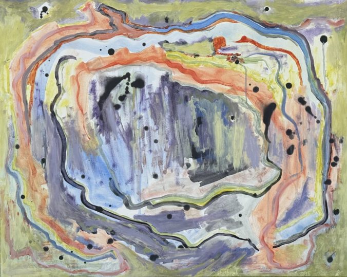

Tsbreh

Bernhard Beyer, Tempera auf Papier, 69x55cm, 10/25.

Es könnte ein Kürbis sein, flächenfüllend dargestellt. Oder ein Klischee von Malerei – vielleicht aus einem Volkshochschulkurs, auf den ersten Blick. Oder gar das Psychogramm der Idee von Malerei selbst?

Hier ist eine grundsätzlich naive Erarbeitung des Formats sichtbar: die Fläche, befüllt mit Pinselstrichen, wie sie jedem Menschen im Blut liegen. Beim Bemalen eines weißen Blattes Papier. Pinselstriche, frei auf der Fläche, ohne Deutung, ohne Bedeutung. Zuerst in freier Entfaltung, raumbildend, das Format abtastend, bis an seine Grenzen gehend. Doch dort ist nur der Rand des Formats.

Im nächsten Moment beginnt das Assoziieren: Ist das eine Höhle? Oder bloß ein Kürbis? Nein, denn oben — dieser Bürzel — könnte der abgekappte Stiel sein, doch die Pinselstriche, die sich erstaunlicherweise rechts und links unten wenden, gehen plötzlich Wege, die kein Kürbis kennt. Die Fantasie bricht ab. Der Pinselstrich bleibt Pinselstrich, das Bild wird wieder zum gemalten Werk, zur aufgetragenen Farbe, zur blanken Illusion.

Und nun? Die Reise darf von vorn beginnen, vielleicht morgen oder übermorgen.

Der unaussprechliche Titel folgt demselben Pfad: vertraut und fremd zugleich. Plötzlich offenbart sich seine Bedeutung — von hinten gelesen: Herbst. Die Entzauberung ist perfekt, denkt der Betrachtende. Doch im nächsten Augenblick ist alles wieder voll von Geheimnis, als wäre das Erklärende nie da gewesen. Die Malerei bleibt undeutbar, fremd, unvertraut.

Und dann, für einen kurzen Moment scheint alles klar — denn wie bei einem Sprung in der Schallplatte, der den Fluss der Musik zerreißt, drängen sich neue Bilder auf: Da eine Pflanze an langem Stängel? Dort eine zweite, doch ihr Stiel knickt ab. Und plötzlich wieder die Höhle.
An ihrer Wand ein Schattenriss – von was? Ein Abbild, das an Platons Gleichnis erinnert? Oder nur die Spur eines Pinselstrichs, der sich weigert, Bedeutung anzunehmen?

In our midst

In our midst.
Among us.
A space emerges before you notice it.
A quiet in-between that you slip into, like a conversation that began long ago.

Lines stretch across the surface, encounter each other, diverge, become entangled. Colors probe, overlap, linger. Nothing stands alone. Everything touches something else.

Here, a dark bundle, like a thought that is condensing.
There, a bright spot, almost incidental—and yet persistent.
Petrol next to umber. Red leaning against ochre.
A green that suddenly steps forward, as if it wants to be heard.

You look—and only later realize that you have long since entered.
That your gaze has become part of the web.

Am I still outside?
Or already among them, among us?

Behind the overlaps, light zones open up, breathing expanses. A blue that promises depth. For a moment, you lose yourself. And find your way back: to the dots, the splashes, the traces of movement. To the restlessness that remains.

Like voices in a room: different, contradictory, simultaneous.
No two elements are alike. And yet something holds them together.
Closeness. Tension. Attention.

Everything remains in flux.
Breaks off.
Begins anew.
Crosses paths.
Loses itself.
Finds itself again.

In our midst— that is not a place.
It is a state.

And within it: life.

Reflexions

Colin oder die innere Farbe

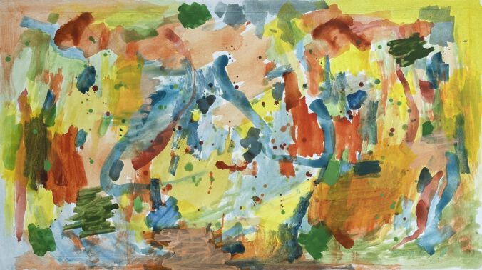
This contemporary painting is not intended to represent external reality. Rather, it is an invitation to perceive the appearance of Colin (the personification of color)—those fleeting spots, streaks, and afterimages that lie on the eyelid—after being dazzled by looking suddenly into the light and closing your eyes. These colors cannot be named or objectively represented; they are an inner color. The painting invites you to recognize how vision turns inward.

The composition appears as a vibrant field of overlapping traces. Warm ochre, yellow, and red tones meet cool blue and gray layers. Drops, splashes, and hasty gestures seem not to have been placed but to have occurred — just as inner color appearances cannot be controlled. These spots are not signs, but remnants of seeing—echoes of light on the retina.

The title, „Colin or the Inner Color,“ opens up a poetic space. Colin can be interpreted as a name, a character, a bird, or something alive—or as a sound that appears and disappears. The longer you look at the color fields, the more fantastical parrots with winding tail feathers or other animals begin to emerge. They are not really there and yet they are not arbitrary. The image allows for freedom in perception: each viewer sees something different.

This is precisely where the inner core lies. What becomes visible is the color each person perceives differently, simply due to the unique nature of their retinas, pupils, and irises, as well as their vision history. No two people ever see the same thing, even if they can discuss it. From an early age, we agree on names — „blue,“ „yellow,“ „red“ — without ever checking exactly which colors and structures are meant.

This image makes this paradox tangible: communication about color is possible. We see together, but never the same thing.

This is precisely where the freedom and indissoluble mystery of vision lie.

„Colin or the Inner Color“ does not show us what we see; rather, it shows us that seeing is an inner, deeply personal process — a place between light and memory, between the eye and imagination.

What we now see is not just the image.

It is our inner color.

Translated with DeepL.com (free version).

Überall

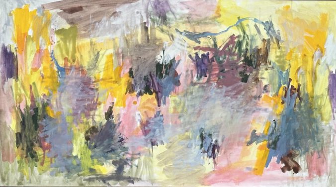
The painting ‚Überall‘ by the artist Bernhard Beyer from 2023 is painted on an HDF plate measuring 45×25″ with eggtempera. The simple frame with shadow joint was made of multiplex especially for the image. The materiality of the eggtempera emphasizes the flatness of the painting.

Bernhard Beyer’s painting goes back to the informal and gives the impression of abstraction at first glance, but can also be discovered as semi-abstract, since the representation is not completely realistic, but with a longer and more closer viewing, a reference to the real world is found or even suddenly sets in.

The painting style is determined by hand-sized color spots distributed on the image surface in different possibilities of color application. The artist applies various techniques such as opaque, stained, dry or wet, open, closed and with a free gesture. The colors of these spots stand on their own and represent their own material and optical quality and quantity. There is no fusion with each other, but the appearance changes due to the superposition of the spots, which can give the impression of a color gradient. At the edges, individual brush strokes seemingly involuntarily flash and a dynamic game begins.

The color spectrum ranges from deep black to other colors to the unpainted white image background without any application of eggtempera. The three basic colors red, blue and yellow dominate. Yellow shines pure, while red and blue occur in pastel-like tones such as rosé and tinted ultramarine up to light azure as well as in mixtures with purple or violet. In between are broken colors such as cream, earth and skin tones. The use of all these colors creates the shocking realization that the picture has gone through 40,000 years of human history and has overcome many challenges. It becomes clear that this way was not easy. This gives the work a natural, rough beauty that fascinates and captivates.

Color stains and overpaints create a strong color tension and a large imaginary space on the surface.

A characteristic feature of the artist is the curved neck-back line, which often appears at the top of the picture, including in this work, but smaller and like a quote from itself. Behind this is a connection between cave painting, such as in Lascaux, and its very own humor. This parietal art shapes the painting style and gives the picture a deep, archaic quality.

This is where the special feature of the picture begins: It reflects the soul of the viewer, as it has not been possible before.

The self-made color of eggtempera with pigments supports this effect, as the shades change in the course of daylight. The bright azure blue of the morning turns into a dark green until the evening, the bright yellow of the day fades into the evening, and so it goes through the day with all colors. This picture experience is of a special kind.

The motives suddenly reproduce. A collection of clearly protruding brush strokes can represent both the contour of a mountain in the distance and a house in the middle image plane and much more. What the eye discovers, be they figures, animals or plants, ultimately also reflects the psyche of the viewer. The image becomes a psychoanalysis for worldly viewers and art lovers who experience self-knowledge through looking here.

The image view becomes an intensive exercise.

The title that cannot be translated into English is ‚Überall‘, which initially means a place that can be anywhere, but also means that all places, this ‚Überall‘, are possible in the picture. In addition, it also includes the universe.

A fascinating thought, an exciting adventure.

In the title, which is deliberately chosen in the German language, there is also the variety of meanings. The title ‚Überall‘ points to the multidimensionality of the work and invites you to an adventure of self-knowledge and worldview.

A successful work.

© 2026 Bildreflexion

Theme von Anders NorénHoch ↑